February 15, 2023
How to Print Your Photos: 5 Tips for Professional Prints: If you've reached the point in your photography journey where you want to start printing your work, first of all, congrats! It took me about four years to get to a point where I wanted to start printing my work, so kudos to you for reaching that milestone.
But the (perceived) problem with printing is that there are so many ways to do so that it can seem excruciatingly overwhelming to those just starting. In this post, I will walk you through six tips for printing your photos and getting professional results. If someone had given me these tips when I was just starting, let's just say I would've saved a lot of money on trial and error. And shipping.

When I first started out, I wondered why people cared so much about printing their photos. But as I've grown into my photography shoes, I've learned that printing your photography is a meaningful way to display, enjoy, and share your work with others. You can create a tangible item that you and others can admire in a whole new way (Instagram is great and all, but nothing beats a fine art print).
I shoot primarily in a digital format, so the idea of holding my work felt like more of a dream than a possibility when I was starting out. That's always been something I envied in other artists who practice with other mediums like paint or clay. Being able to create something with your hands and share it with others without having to rely on electricity or a screen. That's why I embarked on learning how to print my photos.
Another reason I love prints is that they can be displayed in your home or studio and shared with friends, family, and total strangers who happen to love your work (I think they call those fans? Asking for a friend). A print can help you to gain more recognition (if that's what you're going for) and appreciation for your work, as it can be shared with the public and displayed in galleries, local events, restaurants, etc.
But above all else, printing your work is a great way to look back on all the beautiful moments in your life that inspired you to pick up your camera in the first place. To me, the beauty of photography is that you can take a seemingly insignificant moment in time and freeze it in place forever. What makes those moments even more special is that, as photographers, we are sometimes the only ones who get to experience those exact moments.
Now that we've covered the philosophical side of why printing your photos is important let's get into the meat of this post: how to print your photos.

Choosing the right paper for your photography prints is crucial because it can affect the overall look and feel of the print. High-quality paper will make your prints look sharp and vibrant, while lower-quality paper can make them look and feel dull and lifeless.
The right paper can also influence how long your prints last and how they hold up to moisture and light and can help enhance the texture and depth of your photographs, making them more visually pleasing. So what's the problem? For starters, there are more types of paper to choose from than makes of cars on the market (I totally made that up for dramatic effect, but trust me, there are a lot of choices).
There are thousands of different types to choose from when it comes to paper. At first, it can seem like a hopeless endeavor to try and find the right one for you. But luckily, I've tried just about all of them and can confidently help point you in the right direction. To make things easy, let's break our photo papers into two different classifications: regular and fine art.

For those new to printing and not looking to spend an arm and a leg, "regular" photo paper is a great place to start. For the sake of this tutorial, regular photo paper typically lacks texture and comes in at a lower weight in grams per square meter (gsm). In laments, regular paper is usually much thinner and less porous than fine art paper.
For those reasons, regular photo paper is typically less expensive than fine art paper. But the trade-off is that regular paper does not do as good of absorbing ink as fine art paper, which can impact the final image quality and coloring of your print. Another common downside to regular photo papers is that printers tend to use a cheaper printing process, which usually results in poor print quality.
An excellent example of "ultra-cheap" regular photo paper can most likely be found hanging on your fridge at this very moment. Anything you order from pharmacy printing kiosks or websites like Shutterfly uses low-quality photo papers because they are cheap. People don't order photos from those places to hang in an art gallery.
Some popular examples of "good" regular photo paper include Kodak ENDURA Lustre “E” and Fujicolor Crystal Archive Deep Matte Velvet. These papers are excellent choices for photographers looking to print their first few rounds of photos. I used Fujicolor Crystal Matte Velvet for many years until I discovered fine art paper.

To all those that have never heard of fine art photo paper, prepare to have your world changed! Or maybe I'm just a paper nerd, who knows. But in any case, fine art photo papers are like the German cars of the paper world; they're just better. Sure, some of them aren't worth the price, but for the most part, printing on fine art paper always adds some extra life to my photos.
The main differences between regular photo paper and fine art photo paper are, as I mentioned previously, texture and weight (gsm). Fine art papers are typically made using a more artisanal approach. They are usually made in lower quantities than regular photo papers and go through more scrutinous quality control.
Paper manufacturers like Hahnemühle like to play around with different materials and processes to create superbly unique textures and colors in their papers that result in stunning color absorption and crystal-clear sharpness.
Now, something I think needs to be addressed before I talk more about fine art paper: unlike regular photo paper, fine art photo paper is not made exclusively for photo printing. Many artists choose fine art papers for other mediums, such as painting and drawing, because of the quality these papers deliver. So when I referred to these papers as fine art photo paper, I was sort of lying. Okay, that's better; now we can continue.
The biggest takeaway from fine art "photo" papers is that they allow photographers to print their photos in the most flattering and visually stunning ways possible. Thicker paper made from higher-quality materials means more absorption and better image quality. But now that we've distinguished these two paper camps, how do you choose the right paper?

I'm going to rip the band-aid off here: there is no easy answer to this. The unfortunate truth about printing your photos is that paper is a preference, and you will never truly know which paper you will like until you try it.
But, I am going to share with you my favorite papers and in which cases they have worked well for me so that you can have a starting point. If you have never printed a photo before, I recommend choosing a "regular" photo paper to get started and familiarize yourself with the printing process.
I prefer papers with a matte finish as opposed to a glossy or semi-gloss finish because my work is very muted and contrasting. I feel the matte finish complements my work and fits my aesthetic much more than a gloss or semi-gloss. The matte paper I started with, Fujicolor Crystal Archive Deep Matte Velvet, is my top recommendation for those looking for a matte finish.
Suppose your photography is highly vibrant and saturated. In that case, a gloss or semi-gloss paper might be better for you, in which case I highly recommend Kodak ENDURA Lustre “E” because of its rich color absorption and radiance. This paper is also incredibly flattering for HDR photos, in case that's your forte.
But if you have been printing for a little while and are ready to leap into the fine art world, without a doubt, my all-time favorite paper is Hahnemühle Photo Rag. I've used this paper more times than I can count because of its immaculate color absorption, texture, and overall durability. The blacks in my photos get crushed to perfection, and the matte finish perfectly compliments my muted color grading.
Another fine art paper I highly recommend comes from the same brand and is called Hahnemühle William Turner. I have recently switched to this paper for all my print orders because it has slightly more texture than its Photo Rag sibling and holds colors more beautifully than anything I'd seen before.
Fine art papers typically don't come with any glossy or semi-gloss finish because coatings like those tend to cheapen papers, lessen color absorption, and defeat the purpose of having a texture. So if you're going to start using fine art papers, be prepared to ditch the shine.
I implore you to try these papers on a small scale to see if you like them. Remember, paper is a preference, but you will never be able to develop your preference until you have a starting point, which I am hoping you use this post for.

This particular tip is one that many people overlook when printing their photography. Using the right printer can make or break your finished products, so choose wisely. It might not surprise you that I've tried just about every US-based printer and a few from Europe, so I have some opinions I would love to share.
Now, when I say printer, I don't mean one of these; I am referring to a company specializing in printing where you can order custom prints. With that said, I have used several printers that I feel are worth noting in this post. The Print Space is an excellent choice for those based in and around Europe, Bay Photo Lab and Miller Professional Imaging are both superior choices for a wide range of photo prints.
But the printer I use is called FinerWorks. Sure, their website needs some love, but they do tremendous work for a great price. Please note I am not sponsored by any of the companies or products mentioned in this post; I simply want to share my positive opinions where I see fit.
Once you find a printer you trust, the next step is determining which printing process you want to use. Many low-end printers will not offer you a choice, but FinerWorks and The Print Space allow you to choose between Digital C-Type printing and Giclée printing.
Digital C-type printing is a photographic printing process used to produce high-quality color or black-and-white prints from digital image files. The process uses light-sensitive photographic paper, which is exposed to light from a digital image file projected onto it. The resulting print has a very high resolution and can produce prints of various sizes and colors. Digital C-type printing is ideal for producing prints of artworks, photographs, and other digital images.
Digital giclée printing, on the other hand, is a high-quality printing method that uses archival, fade-resistant inks to produce prints with vibrant colors and rich details. The method uses large format printers, usually those that use inkjet technology, to produce prints with a wide color gamut and high resolution. This printing method is often used to produce fine art reproductions and photographs.
Both processes will produce superb results, but I think giclée printing produces better results on fine art paper for my aesthetic. I encourage you to try both methods and see the difference for yourself.
When choosing a printer, the biggest thing to consider is the final product. That sounds like a no-brainer, but many people judge a printer by its online presence, ordering system, or marketing. Don't let them fool you; the best printers are the ones that deliver a stunning final product that exceeds your expectations.
I recommend ordering small test prints from several printers to see which works best for your aesthetic. Don't be afraid to spend a little money to determine which option works best for you. If you want my opinion, I can't recommend FinerWorks enough.

One of the most critical steps in the printing process is often overlooked: calibrating your monitor.
If you have a Mac computer or display, there's a good chance that your monitor is already calibrated to perfection because Apple does a great job with colors right out of the factory. But, an important thing to note is that current lighting conditions will affect the colors on your screen, so make sure to work in a well-lit and neutrally-lit room without a glare on your screen. This will ensure accurate colors.
If you are a Windows user, I recommend purchasing a color calibration tool so you can activate a solid color profile to achieve the most accurate color results before printing. Since most Windows users use varying brands for their monitors, it is imperative to calibrate your screen(s).
The process for calibrating your monitor depends entirely on which calibration tool you use. Make sure to follow the instructions with your tool and try your best to achieve a neutral color profile with a white balance as close to 5500K as possible.
A general rule of thumb is to calibrate your monitor each time before you edit a photo for printing. Make sure to let your monitor heat up for 30 minutes before calibrating. Otherwise, you will risk your colors changing as your monitor temperature increases.
A printer profile is a set of instructions that tells a printer how to reproduce colors in a specific manner for a specific type of media. By using a printer profile, you can ensure that colors are accurately reproduced on the printed media. This is especially important for photographic prints, where colors are critical. Without a printer profile, colors may be off and the image may not look as good as it should.
Most printing companies have printer profiles that you can download for each type of paper, so be sure to download and install them in your photo editing software to ensure optimal color accuracy. Most times paper will absorb colors and create a desaturated final look if you do not use a printer profile to proof your photo beforehand.

Although every step of this process is equally as necessary, the easiest way to destroy a photo print is by using the wrong export settings. One wrong box checked or missed can result in poor image quality and a ruined print. So make sure to export your photos correctly for optimal results.
High-end printers will always accept .tiff files. I recommend always using uncompressed TIFF files when possible to retain the most detail and color accuracy in your photos. Uncompressed TIFF files are much larger in size than JPEG files, but they make a huge difference in print image quality.
Most printers will also list their recommended export settings, so be sure to scour their website. In my experience, most printers recommend an 8-bit uncompressed TIFF file in sRGB.
The industry standard for high-quality photo printing is to retain a resolution of 300 dots per inch (dpi). A standard computer monitor has a resolution of 72 pixels per inch (ppi), equivalent to 72 dpi (PPI and DPI are interchangeable, but one refers to screens whereas one refers to prints).
For more information on resolution, read this great article.
If you have a photo with a resolution of 9504x6336 pixels, the maximum size you would want to print would be 31.68"x21.12" to ensure you retain at least a resolution of 300 dpi. To figure out the maximum print size, simply divide each dimension by 300 to get your maximum size in inches.
I do not recommend going below 200 dpi on a photo print. Otherwise, you will notice a severe decline in image quality.
On a Mac, you can check the resolution of your digital photo by opening the photo in Preview and selecting Tools > Adjust Size. On a Windows PC, you can check the resolution of your digital photo by opening the photo in Paint and selecting Image > Attributes.
Alternatively, you can right-click a photo on a Mac and click "Get Info" to see the image resolution, and on a Windows PC, you can right-click the photo and click "Properties" to see the same information.

I recommend starting this step out of the camera itself. Most cameras allow users to set the color profile to either sRGB or Adobe RGB. The main difference between sRGB and Adobe RGB is the range of colors each can produce. sRGB produces a more limited range of colors, while Adobe RGB produces a broader range of colors. sRGB is the most common color space used in digital cameras, monitors, and other devices. Adobe RGB has a broader range of colors, making it better for printing.
I always shoot in Adobe RGB to get the most color out of my photos. I also set my creative profile to the lowest contrast, sharpness, and saturation settings so I always get a truly raw photo that I can fully customize.
That said, most monitors cannot display the entire Adobe RGB spectrum, so I recommend exporting your photos in sRGB from your photo editing software. For more information on color spectrums, read this great article.
To summarize, shooting in Adobe RGB ensures you get the most colors out of your sensor, and exporting in sRGB ensures your screens and printers will show the most accurate colors possible. This, of course, is another subjective practice, but when printing, always refer to your printer for the proper color profile to export in.

The devil is in the details! Every minor defect on your photo will be amplified when printed, so make sure to proof your photo several times before sending it to the printer. If your crop isn't perfect, fix it. If a piece of lint on your subject is a bit distracting, spot-heal it from your photo.
If you made an attempt at masking a subject out of the frame, make sure it looks perfect on the screen; otherwise, it will be an eye sore on paper.
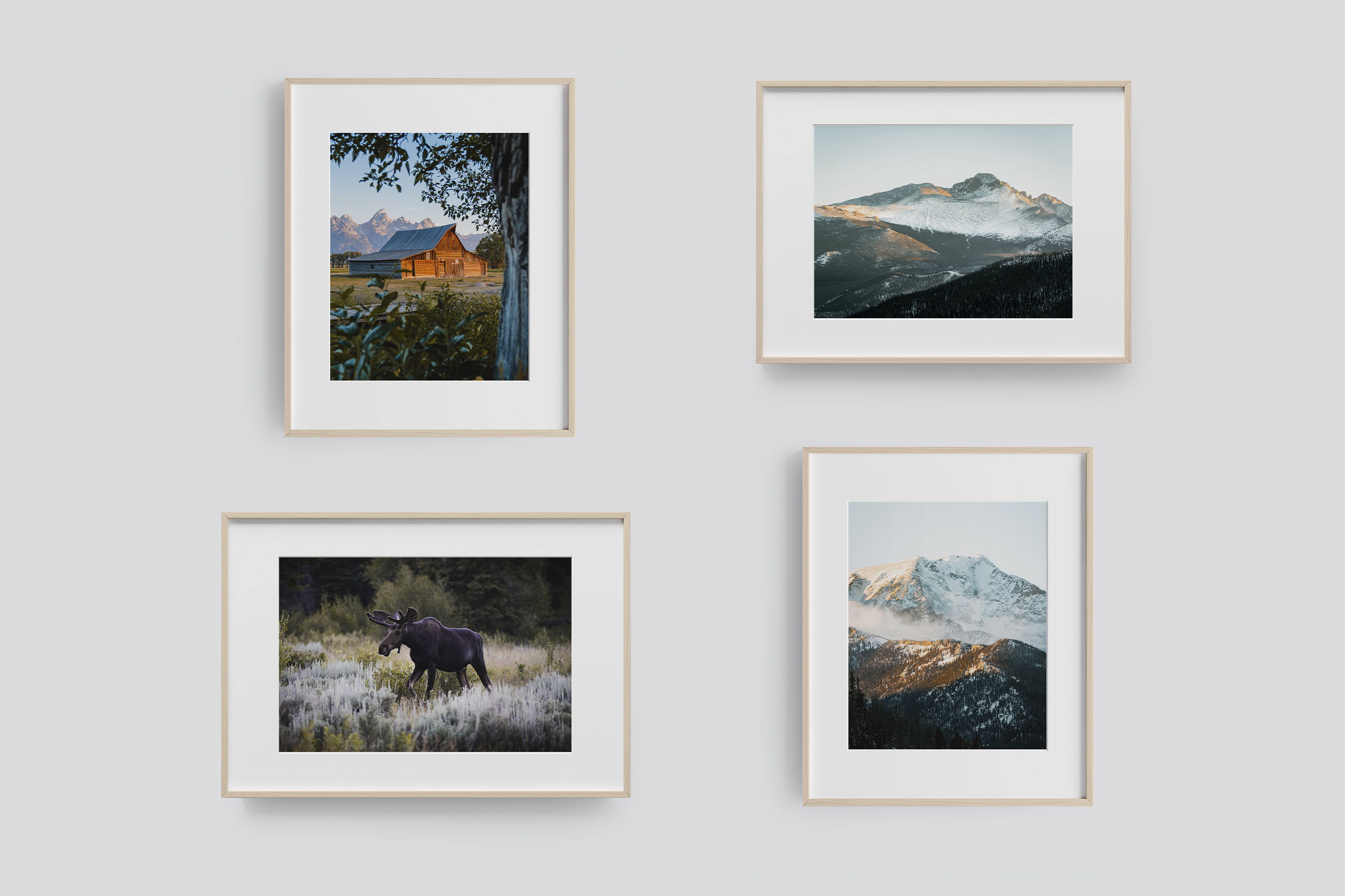
One final detail to note when printing is borders. I often print with a border because people like to add matting to my photos before they frame them. A border helps attach the matte to the photo without worrying about a gap between the print and the matte.
I also think borders are a nice separation between the artwork and the frame if no matte is involved. Either way, I recommend a 1" border because it makes mounting your work easier and adds a nice stark contrast to your piece.
If you can help, do not touch your prints with your bare hands. Oils from your hands can transfer to your print and corrode the inks in the paper over time. This is especially true in fine art prints or regular photo prints without a protective coating. Use white gloves if possible.
Also, be sure to avoid folding your prints. Any creases in the paper will not come out, so be sure to transport your prints the same way they came in the mail.
Printing your photos can be a daunting task. There's no way around the fact that you will have to do some trial and error to figure out what works best for you because at the end of the day, printing is almost as subjective as your artwork itself.
I've been printing photos for the last six years and have spent more money than I care to admit trying to figure out what style I like best. I've also used more printers than I have fingers and have been burned a few times in the process.
The mention of every product, business, method, and tip stated in this post resulted from years of practice and failure until I eventually found what works for me. Don't expect your prints to be perfect right away; it's going to take some time to get them just right. But don't ever give up; more importantly, don't be afraid to fail along the way.
If you have any questions or would like me to post more about printing topics, please feel free to let me know. Thanks for reading!